About the
Project

  • Client
    Texas Premier Medical Transport
  • Year
    2025
  • Project
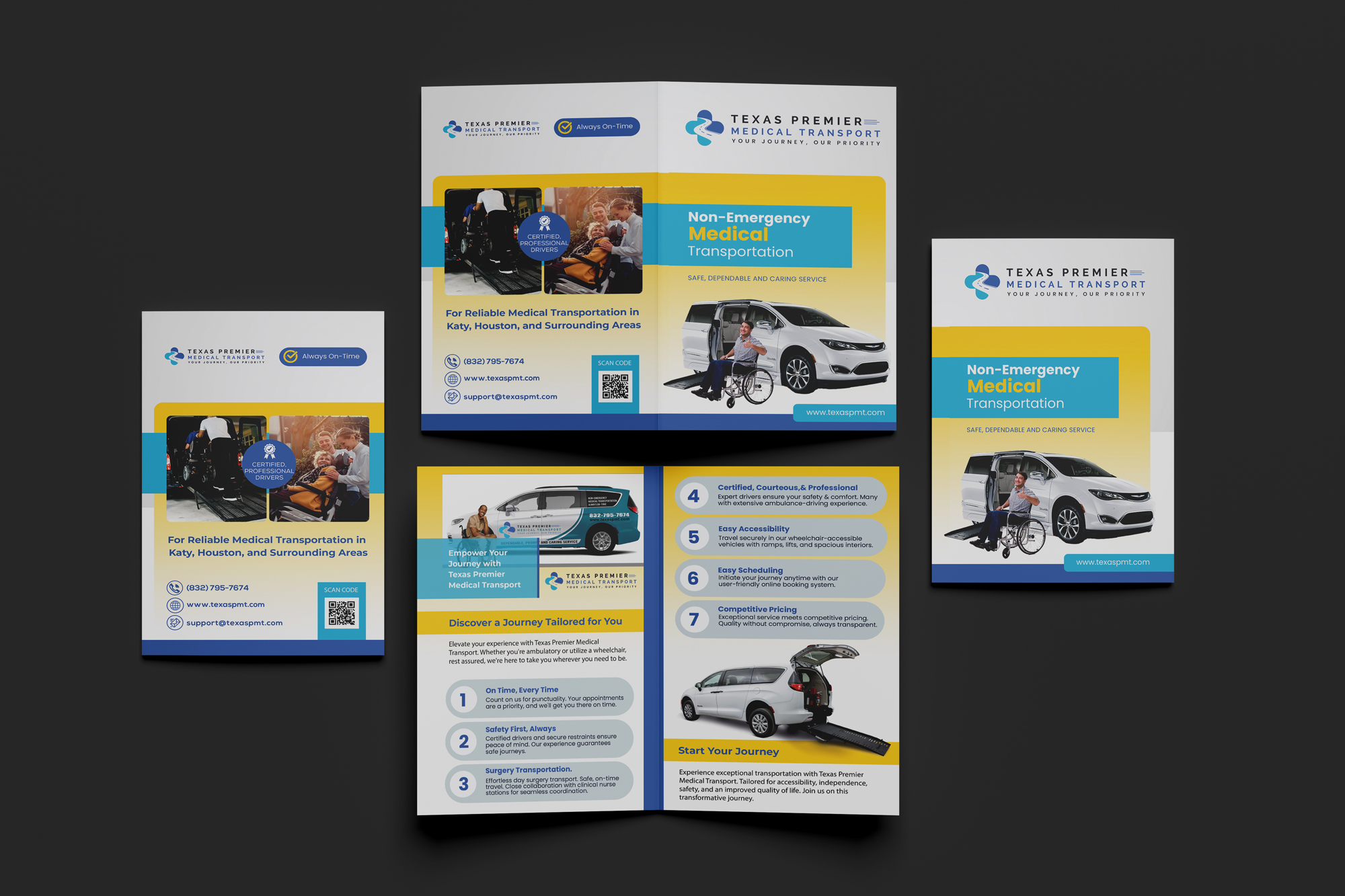
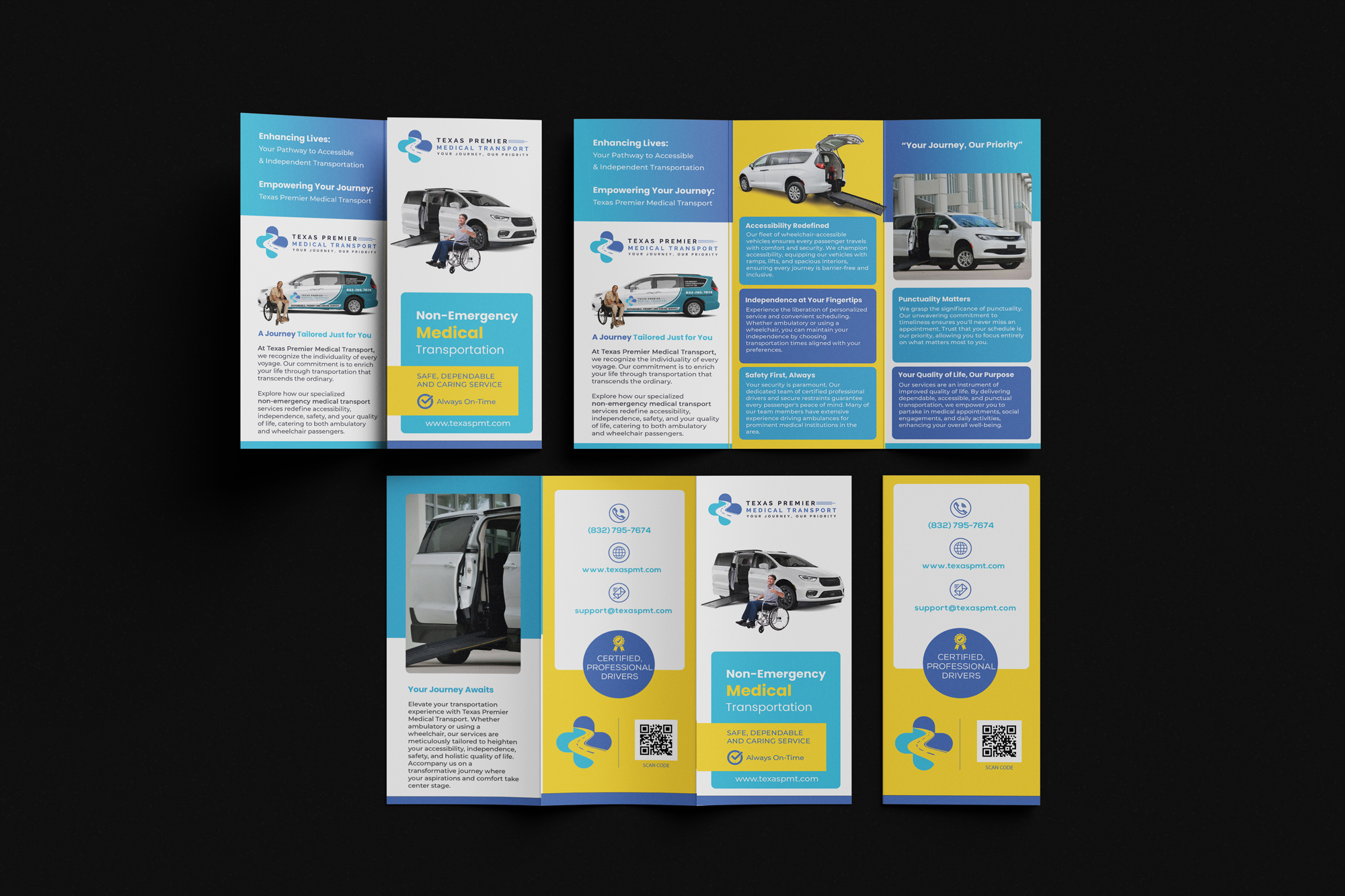
    Bifold and Trifold Brochure designs

The
Process

THE BRIEF

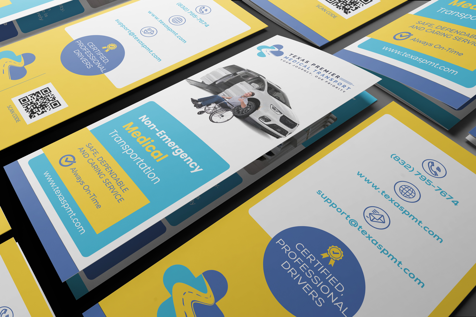
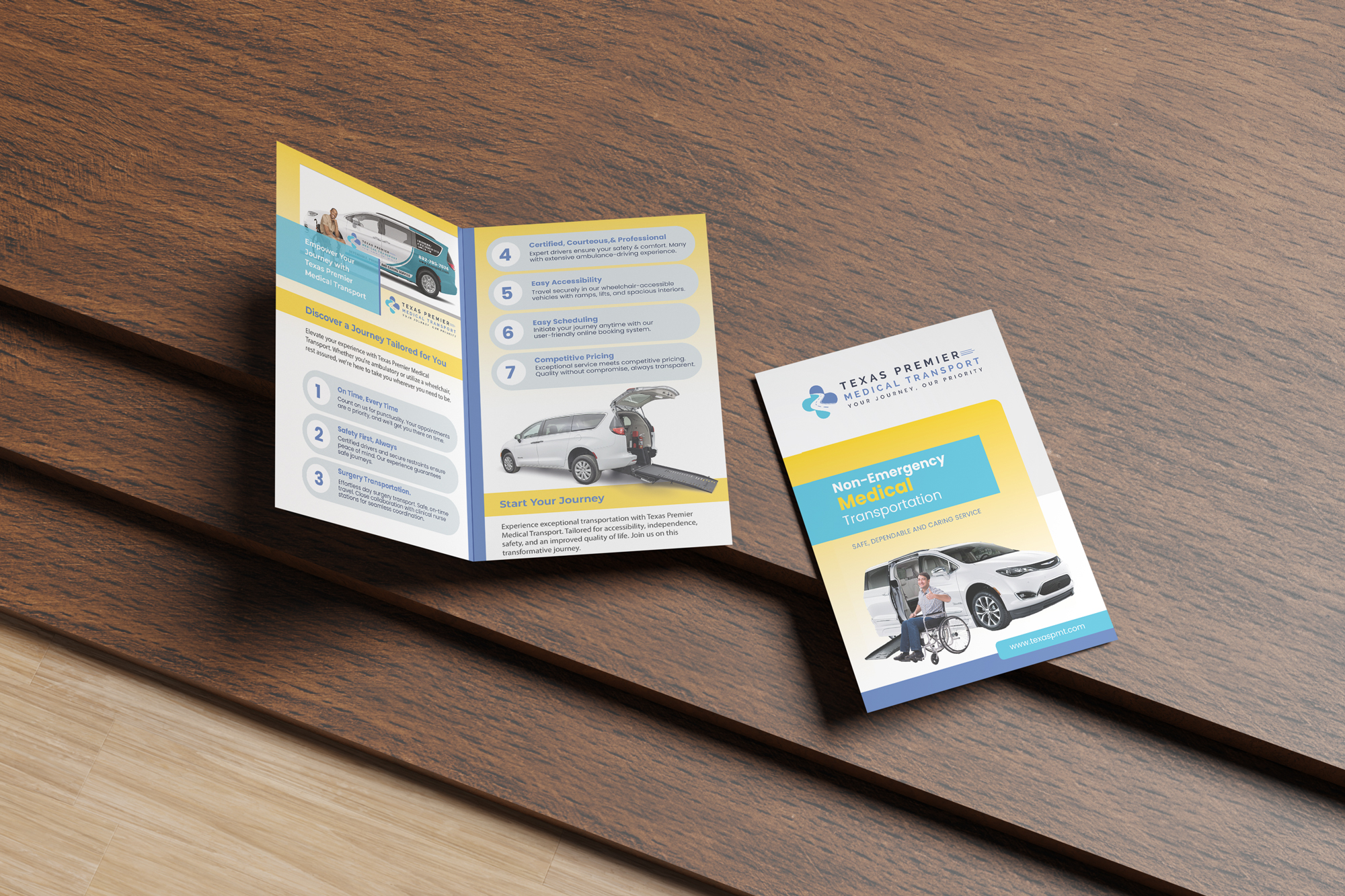
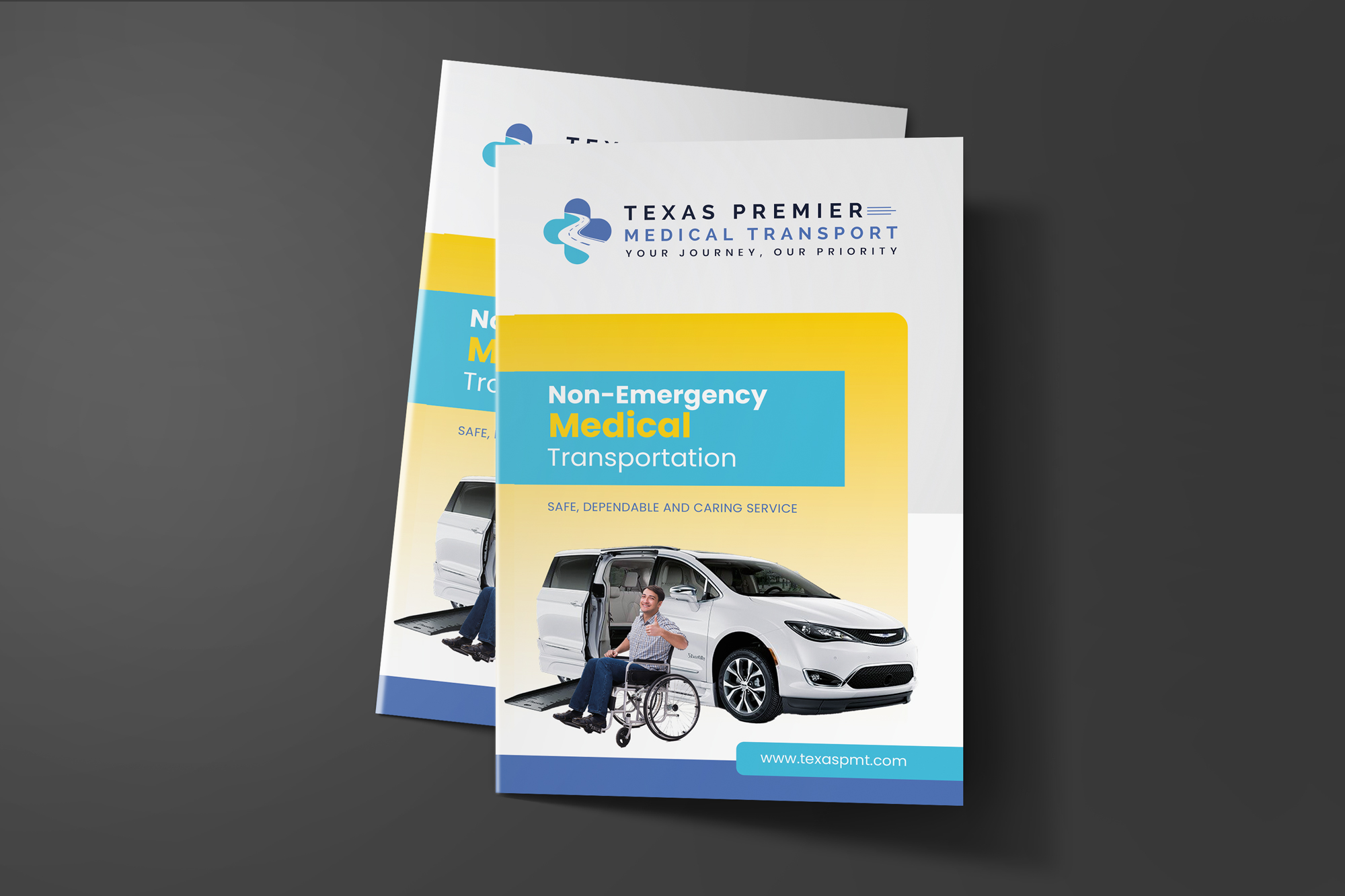
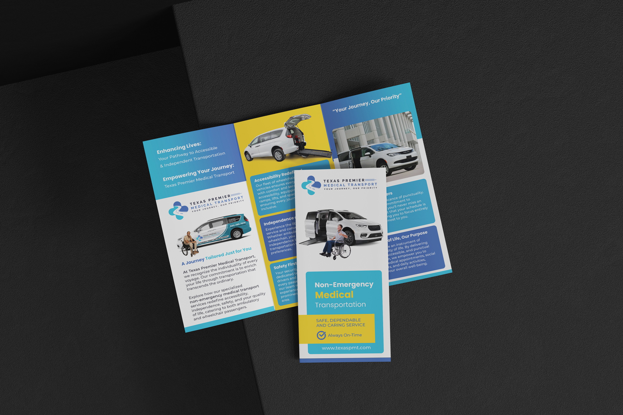
Texas Premier Medical Transport provides reliable non-emergency medical transportation services in Katy, Houston, and the surrounding areas, and we are seeking the design of both a bi-fold and a tri-fold brochure to promote our services. The brochures should reflect professionalism, compassion, and trust while staying visually engaging and easy to read. We will provide our logo, and the color palette should focus on calming tones of sky blue and soft yellow. Since we do not have brand guidelines, the designer should establish a clean and modern look using high-quality stock photography that conveys safety, reliability, and care — such as patients being assisted, accessible vehicles, and supportive driver-patient interactions. Content will include an overview of who we are, the services we provide (including wheelchair-accessible transportation, hospital discharges, rehab, dialysis, and routine medical appointments), our service area, and key reasons to choose us such as professional drivers, safe vehicles, and dependable service. Both brochures must clearly feature our contact details and can include a QR code for quick booking. Deliverables should include print-ready files for both brochures as well as digital PDF versions for online sharing. The ultimate goal is to build trust with patients, families, and healthcare providers while positioning Texas Premier Medical Transport as the leading choice for non-emergency medical transportation in the region.

MY APPROACH

The key to this project is balancing trust and professionalism with warmth and compassion. Texas Premier's client base includes patients, families, and healthcare providers so, the design must communicate credibility and reliability.

The chosen color palette of sky blue and soft yellow will provide the calm and approachable look that i would go for. I paired that color scheme with clean typography to ensure all information is clear and easy to read.

I chose to map out the hierarchy of information, ensuring that the most important details like services, location, and contact information are in the forefront and not crowded.

In terms of visuals, high-quality stock photography of caring interactions (patients being assisted into vehicles, friendly drivers, supportive medical transport scenes) will establish emotional connection. Typically client's provide an abundant amount of copy for brochures and this project was no different. I wanted my Layouts to use ample white space to avoid clutter and reinforce clarity, while subtle design elements like icons can help break down services visually. Consistency across both brochures is essential so that the materials feel cohesive and reinforce the brand identity, even without a formal guideline.