About the
Project

  • Client
    Next Care Solutions
  • Year
    2025
  • Project
    Art Direction | Brochure | Flyers | Business Cards

The
Process

THE BRIEF

Project Deliverables:

  • Trifold Brochure

  • One-Page Flyer

  • Business Card

Brand Identity & Messaging:
NEST Care Solutions is a trusted guide in senior living, dedicated to helping families find the right care with compassion and expertise. The tone of all materials should be warm, supportive, and professional—balancing trustworthiness with a sense of comfort and relief. The tagline “Navigating Elder Support & Transitions – Your Trusted Guide in Senior Living” should serve as a consistent brand anchor across all designs.

Color Palette:

  • Soft Green – symbolizing care, growth, and tranquility.

  • Soft Yellow – warmth, optimism, and compassion.

  • Brown – stability, grounding, and trust.

These colors should be used in a clean, harmonious way that communicates both empathy and professionalism.

Imagery & Style:

  • Use photography of seniors with family, advisors in conversation, and warm, home-like community settings.

  • Avoid overly clinical or sterile visuals—focus instead on supportive, uplifting imagery.

  • Design should feel approachable, with soft edges, clean layouts, and ample white space.

  • Consider subtle nature-inspired motifs (nests, leaves, light textures) to reinforce the “NEST” concept.

MY APPROACH

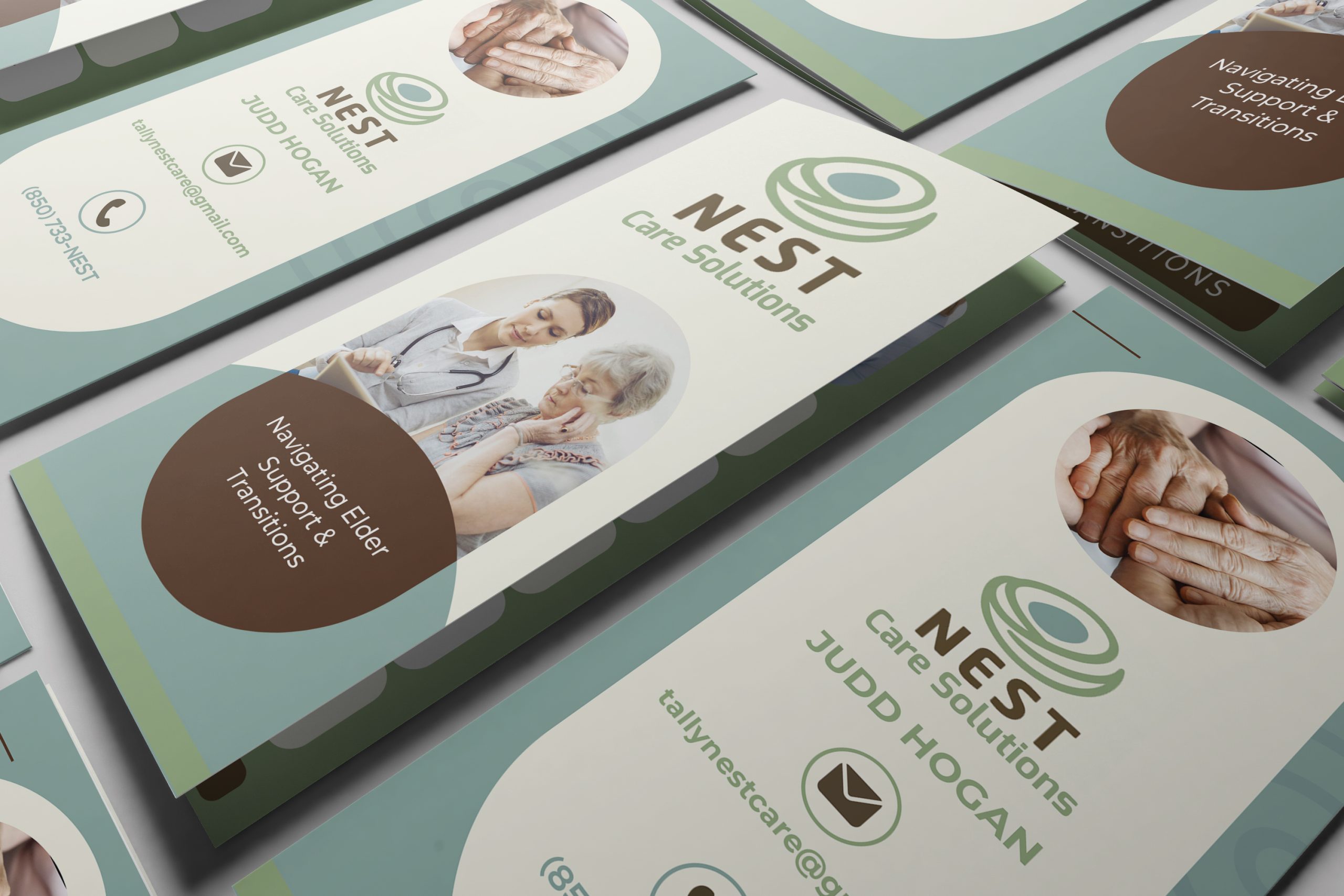
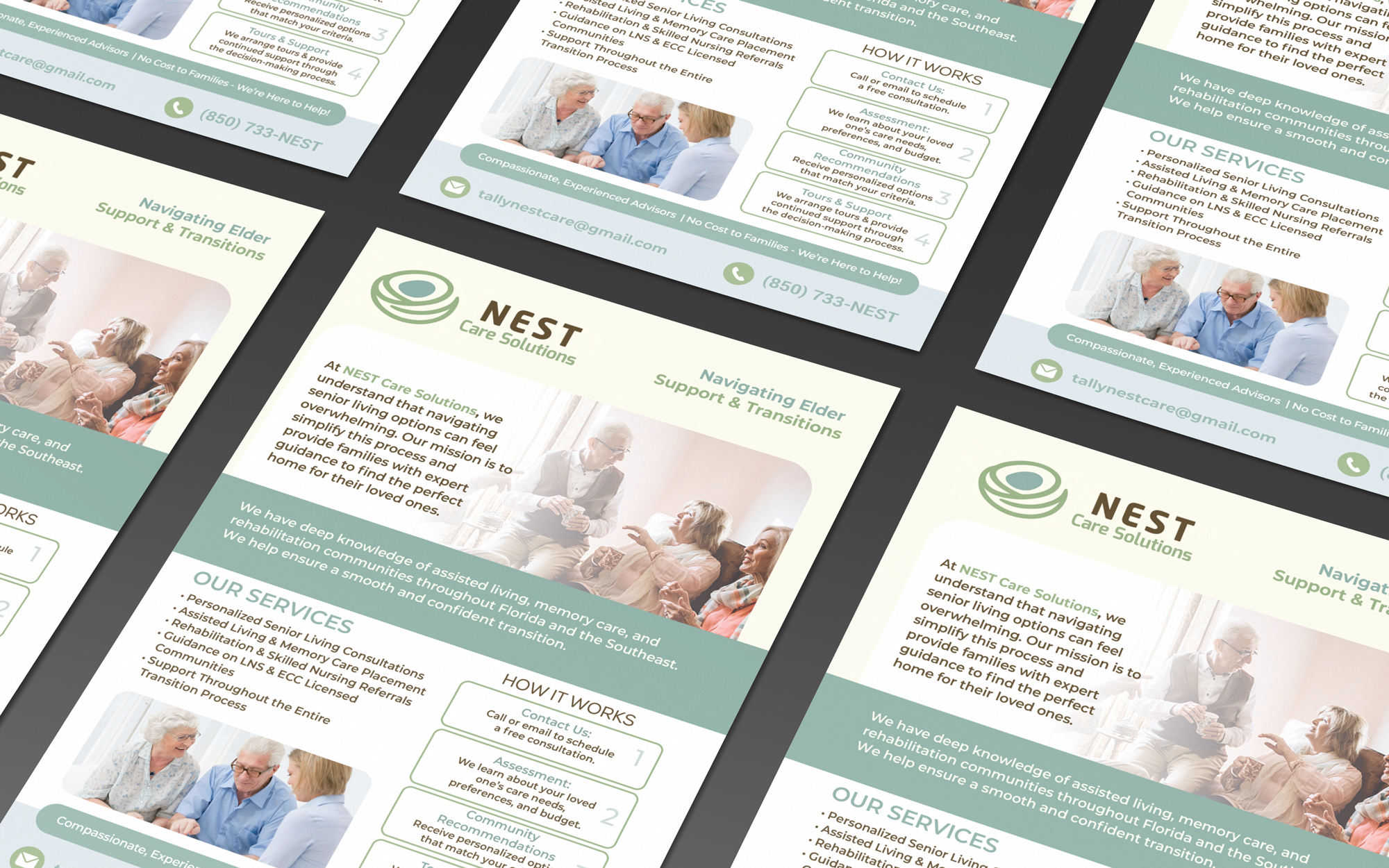
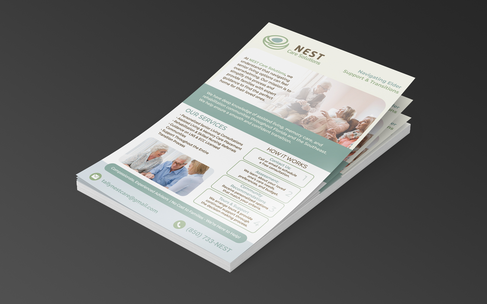
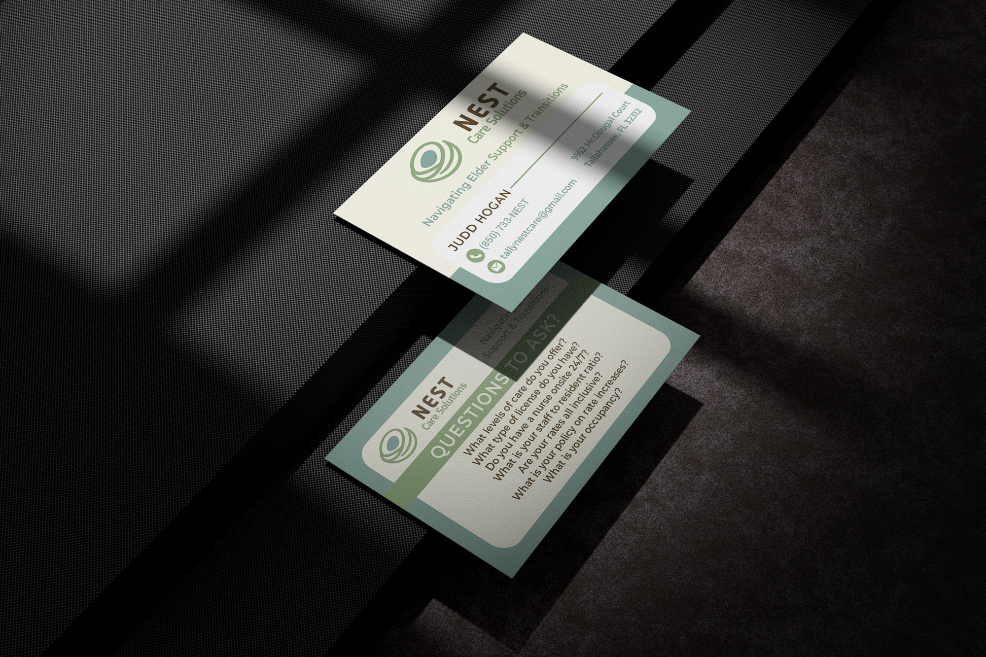
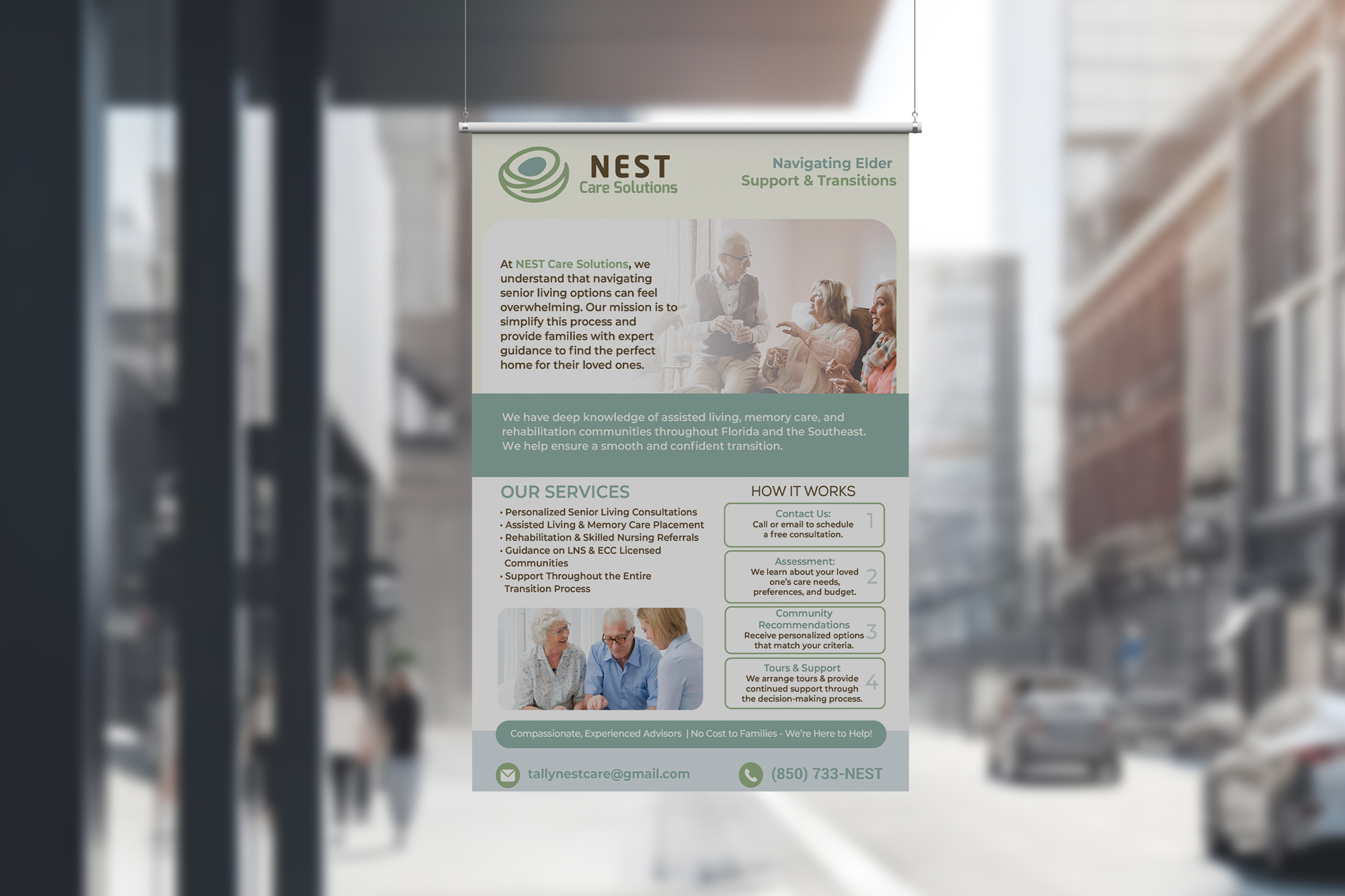
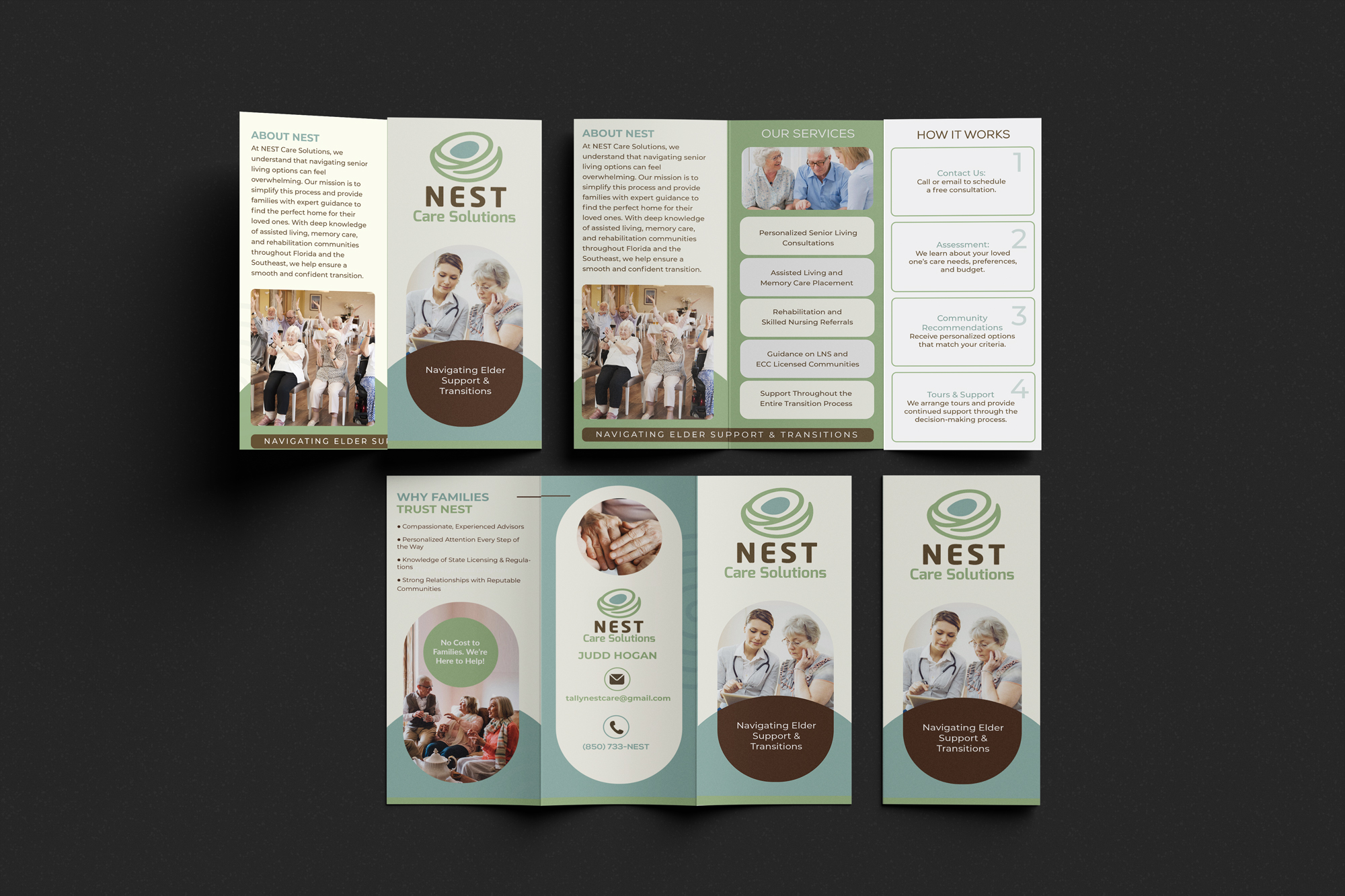
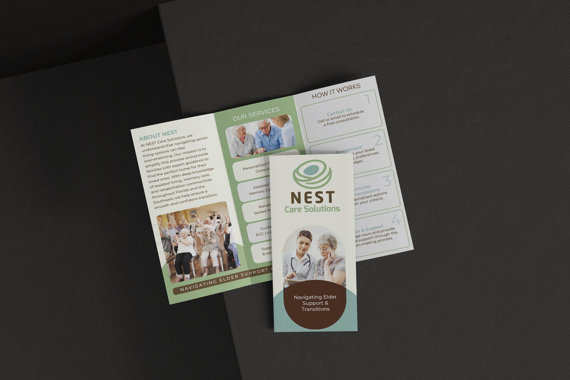
When designing for NEST Care Solutions, I wanted to focos on empathy, trust, and clarity. I understand Families that are seeking senior care are often overwhelmed and looking for comfort. That let's me know that design must feel warm, approachable, and trustworthy and not so clinical like a medical office.

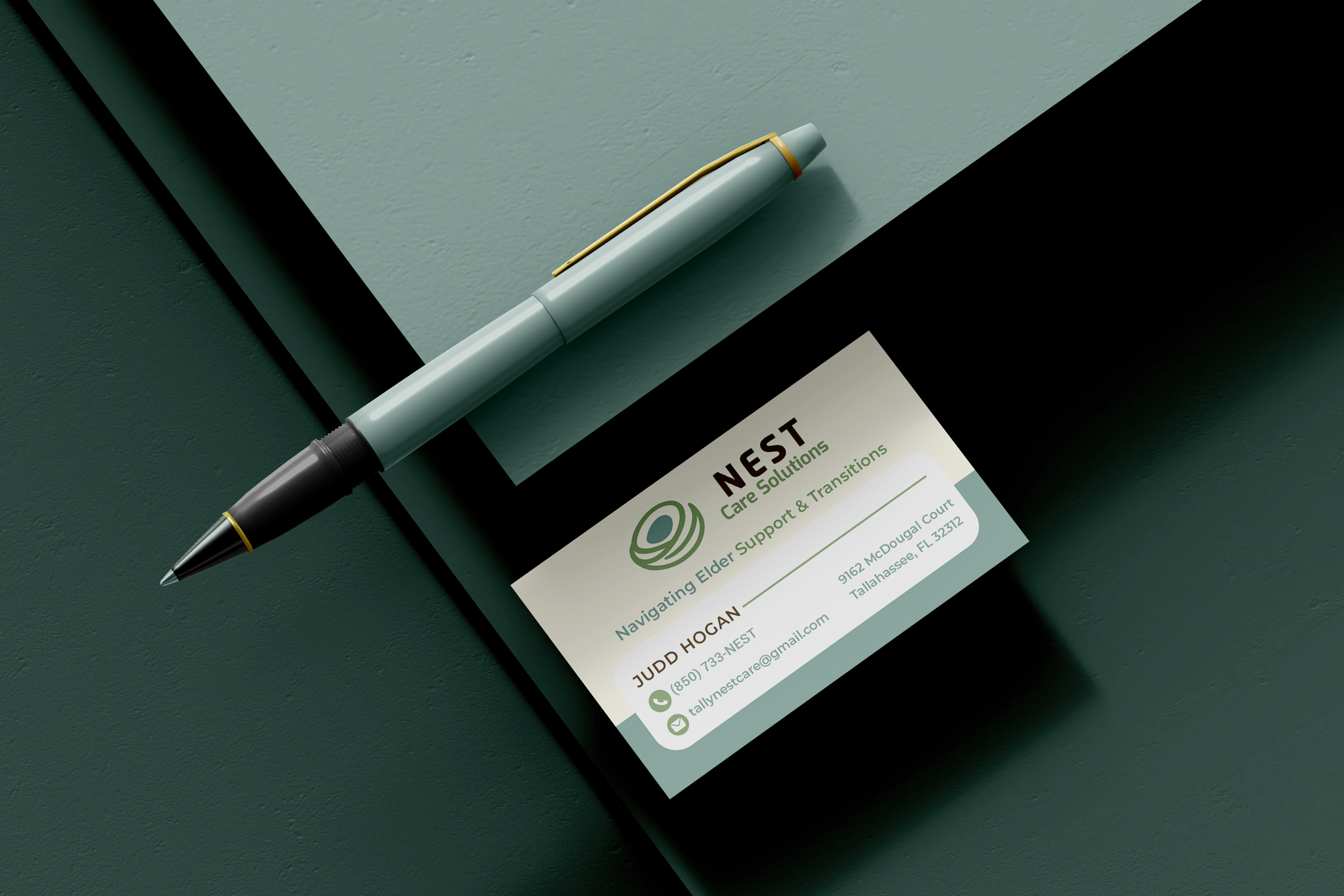
The client logo gave the direction for chosen palette of soft green, soft yellow, and brown naturally communicates healing, compassion, and stability.
Pairing those colors with clean typography and the perfect photography Imagery should highlight genuine human connection like families, seniors, and advisors in supportive, positive moments.

My goal was to create designs that clean and easy to read, with clear headers, icons, and call to action.

Each design piece has a role: the brochure tells the full story, the flyer delivers a quick snapshot, and the business card provides a personal touch. Across all materials, consistency in color, fonts, and imagery ensures brand recognition. Overall, the design will visually comfort the client through a difficult transition.